
02. Predictive Analytics
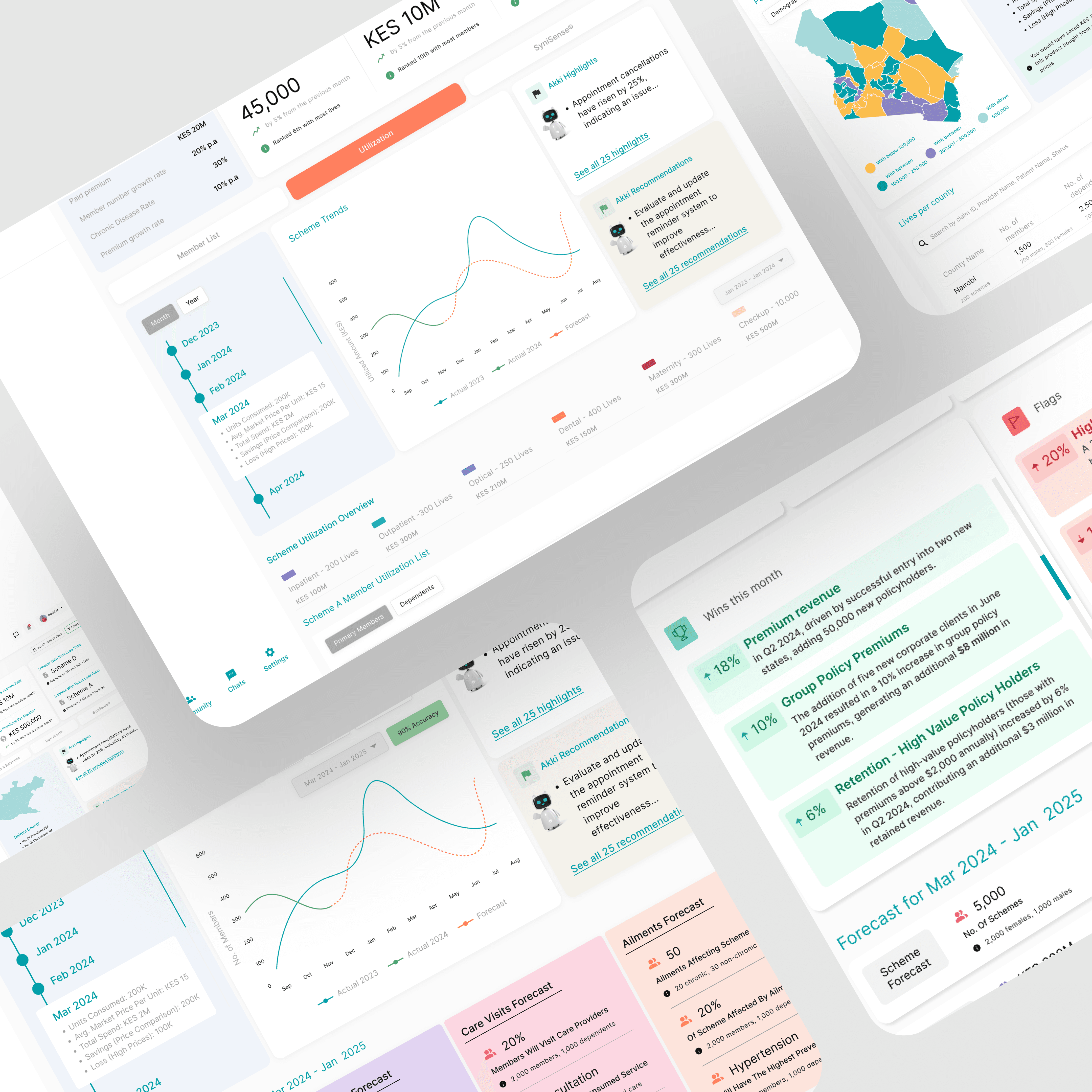
Working with Syni.ai and Xetova, I led the product-design track for a predictive-analytics AI that helps FMCG suppliers, healthcare distributors, and insurers anticipate demand, flag risk, and optimise inventory. By visualising machine-learning forecasts as easy-to-scan widgets—demand curves, confidence bands, and “next-best action” prompts—the platform has boosted forecast accuracy by +19 %, cut stock-out incidents by –27 %, and enabled portfolio managers to make data-backed decisions in a single glance.
Client:
Xetova, Syni.ai
Role:
Lead Product Designer
Context & Problem
• FMCG, health-sector, and insurance partners handled millions in SKU or policy data but relied on spreadsheets for forecasting.
• Inconsistent demand signals → excess stock or missed sales; actuarial teams struggled to surface anomalies fast enough.
• Stakeholders needed a visual layer that turned raw predictions into actionable next steps—without drowning users in ML jargon.
Objective
Transform black-box ML outputs into a dashboard that predicts demand or claim risk, surfaces anomalies, and recommends actions (“Order +12 %”, “Flag high-risk policy cohort”).
Key Deliverables
• Predictive Dashboard UI Kit (12 chart components, risk badges, priority queue).
• Explainability Overlay—click to reveal key model drivers without exposing proprietary math.
• Alert Rules Builder—no-code thresholds for “high variance” or “supply shock” scenarios.
• Design System Tokens shared with Syni & Xetova engineers for future modules
What I Learned
• Explainability boosts adoption: users trusted forecasts when drivers were transparent.
• Unit consistency matters: aligning °C, %, and currency across widgets cut user errors.
• Paired prototyping with data scientists clarified edge-cases early, avoiding costly rework.
02. Predictive Analytics
Working with Syni.ai and Xetova, I led the product-design track for a predictive-analytics AI that helps FMCG suppliers, healthcare distributors, and insurers anticipate demand, flag risk, and optimise inventory. By visualising machine-learning forecasts as easy-to-scan widgets—demand curves, confidence bands, and “next-best action” prompts—the platform has boosted forecast accuracy by +19 %, cut stock-out incidents by –27 %, and enabled portfolio managers to make data-backed decisions in a single glance.
Client:
GATECH
Role:
Content
Context & Problem
• FMCG, health-sector, and insurance partners handled millions in SKU or policy data but relied on spreadsheets for forecasting.
• Inconsistent demand signals → excess stock or missed sales; actuarial teams struggled to surface anomalies fast enough.
• Stakeholders needed a visual layer that turned raw predictions into actionable next steps—without drowning users in ML jargon.
Objective
Transform black-box ML outputs into a dashboard that predicts demand or claim risk, surfaces anomalies, and recommends actions (“Order +12 %”, “Flag high-risk policy cohort”).
Key Deliverables
• Predictive Dashboard UI Kit (12 chart components, risk badges, priority queue).
• Explainability Overlay—click to reveal key model drivers without exposing proprietary math.
• Alert Rules Builder—no-code thresholds for “high variance” or “supply shock” scenarios.
• Design System Tokens shared with Syni & Xetova engineers for future modules
What I Learned
• Explainability boosts adoption: users trusted forecasts when drivers were transparent.
• Unit consistency matters: aligning °C, %, and currency across widgets cut user errors.
• Paired prototyping with data scientists clarified edge-cases early, avoiding costly rework.